


On the Cineplex creative team, we all knew the theatre branding needed a revamp. The colours were too dark, the typography didn't stand out, nothing was consistent, and it all lacked any coherent story or concept.
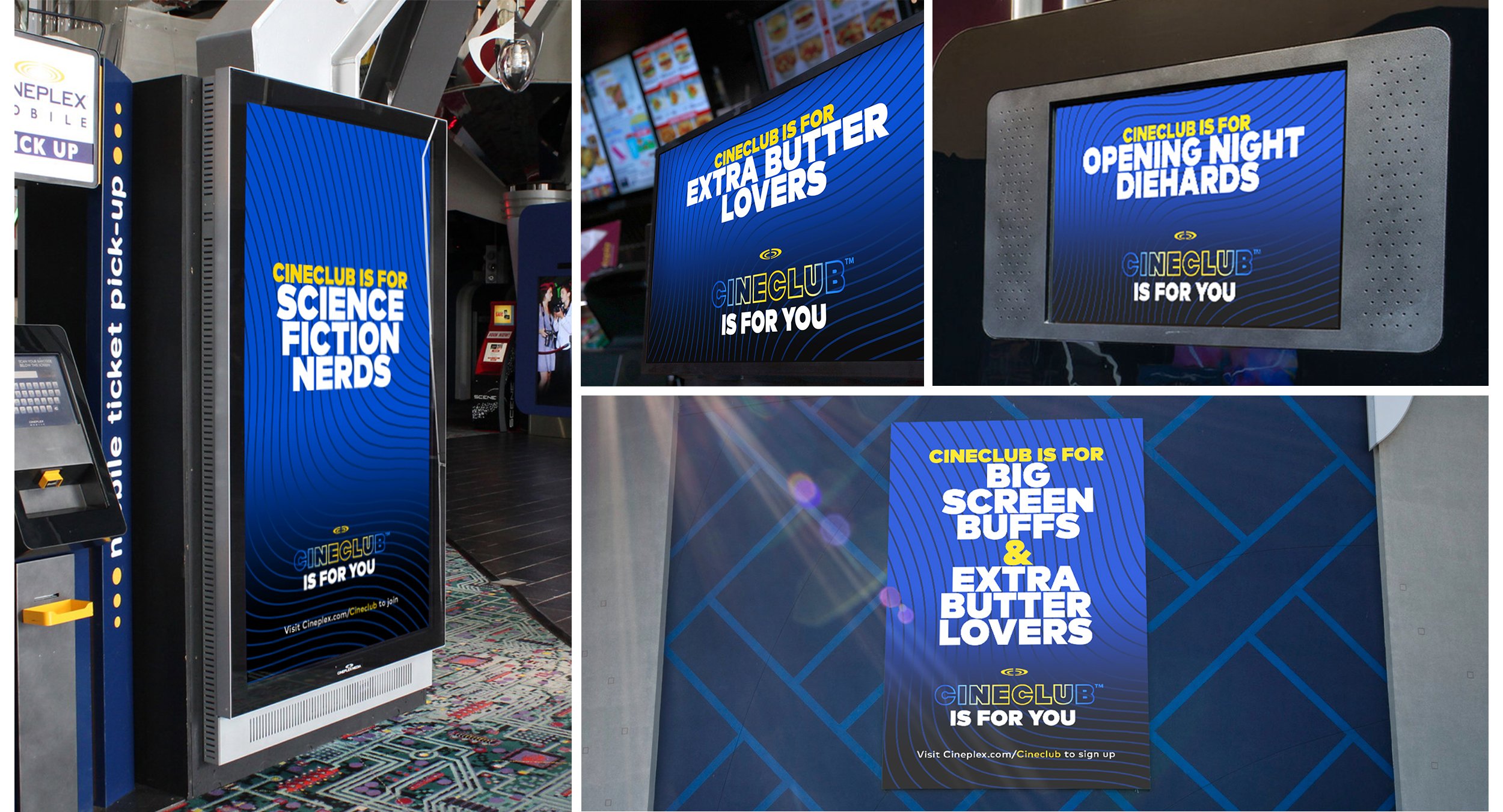
The idea we sold through was simple: "make the brand feel more cinematic." This resulted in a refreshed logo, brighter, more digital-friendly colours, and an updated style guide, bringing new energy and consistency to everything from social media to in-theatre displays, print, and OOH.
It started with the logo, where we brightened the colour palette and created an alternate “2 Ring” logo to work better in smaller spaces.
The new look also worked great in layouts that used the new lifestyle photography, where the text and branding really popped.
And was used to great effect in the Cineclub launch campaign.